Quotes from users, post-launch
"Well done on a really clean looking site. The front page looks very engaging and presents a really simple to understand breakup."
"I just wanted to congratulate the team on a great design."
"I am really enjoying the mandates and ease of navigation."
Almost a year after launch, average session duration has settled at 200%, with average sessions per month increasing 11%
Casework Practice was not only nominated for a Premier's Excellence Award, but since launch has had the interest of other state governments, to create a similar resource for their regions.
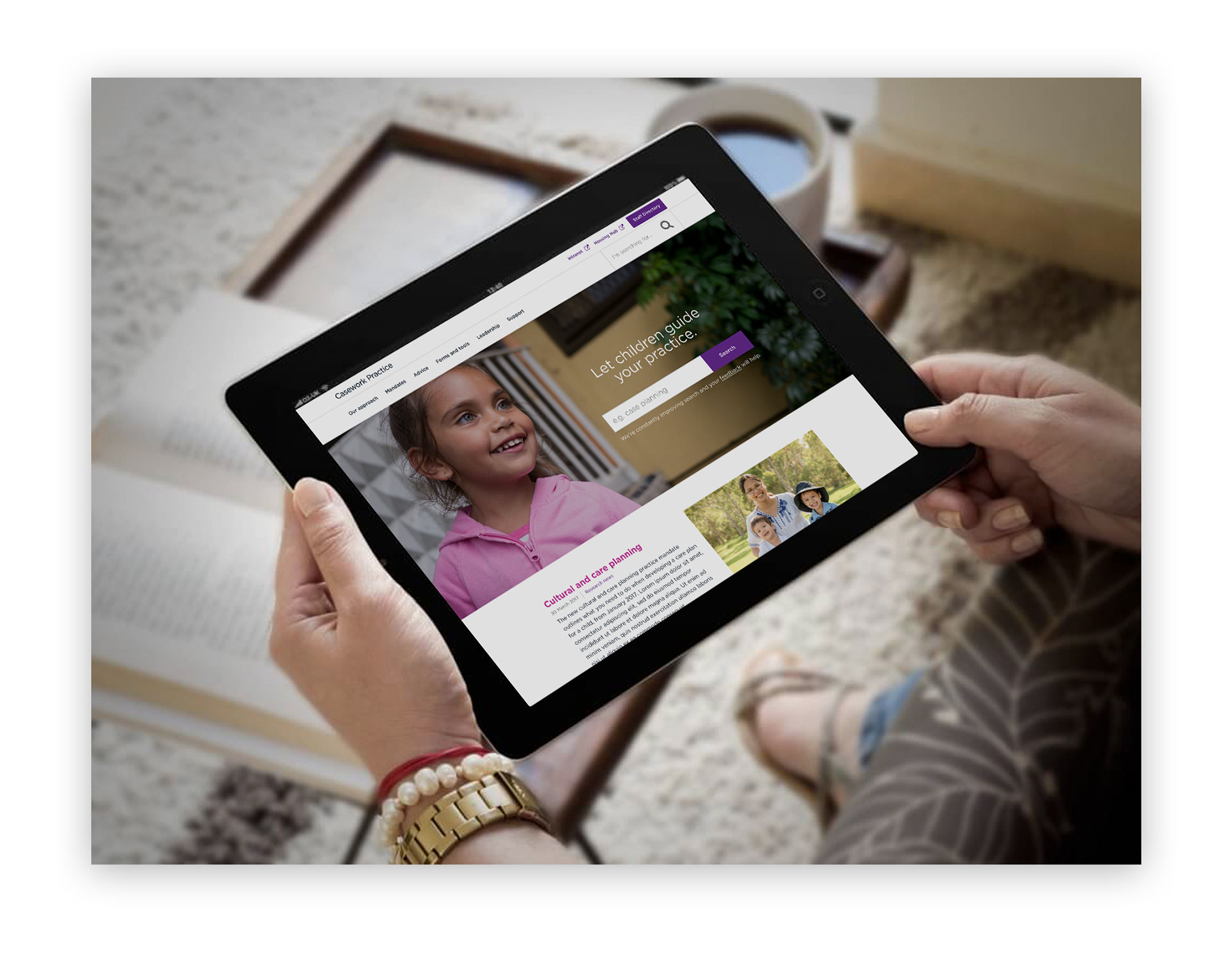
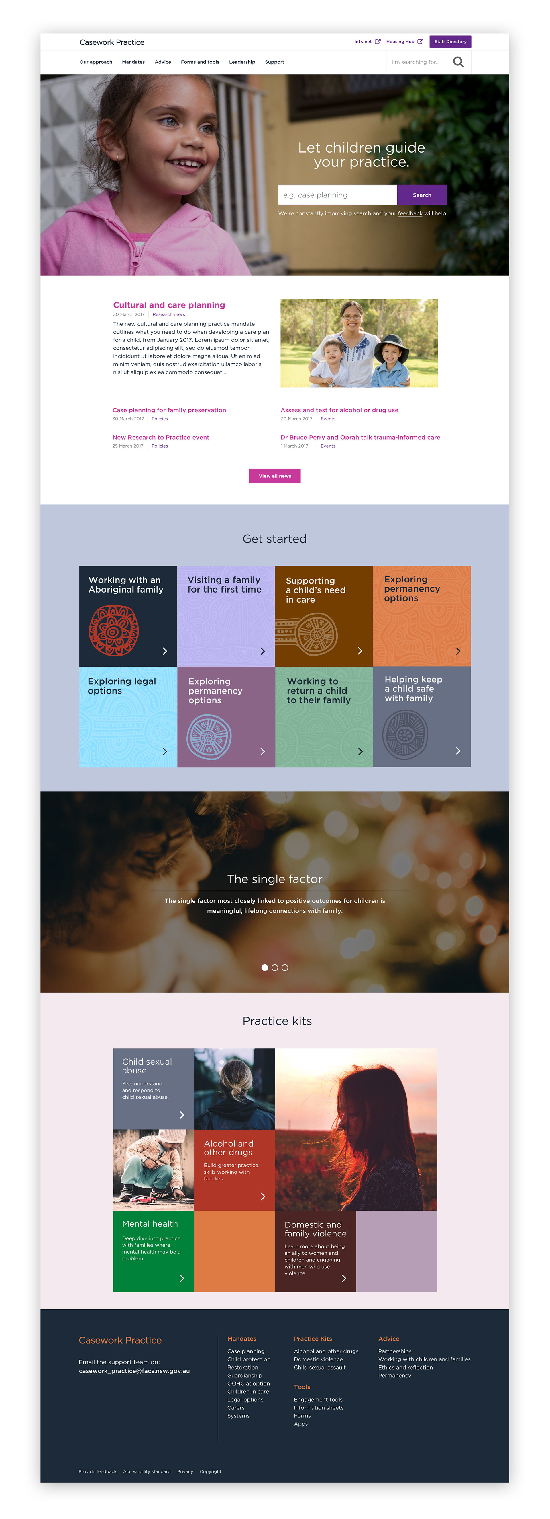
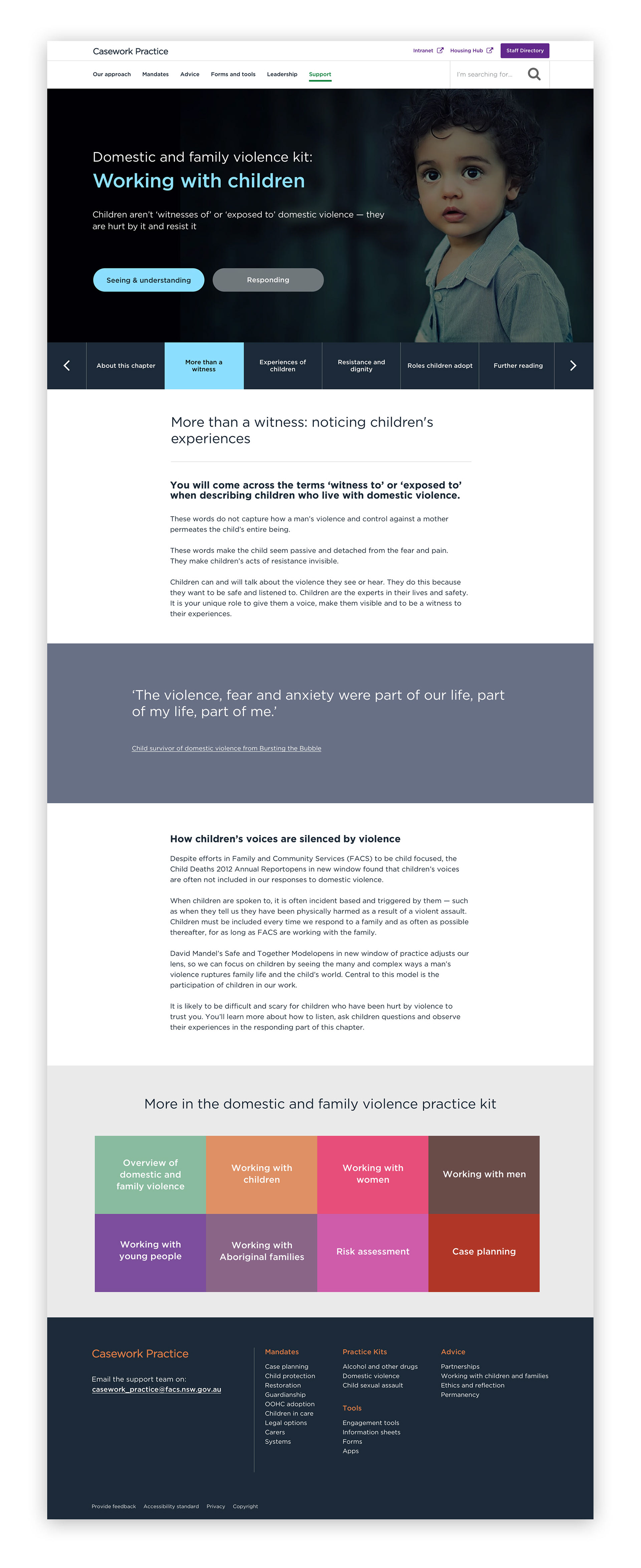
What is Casework Practice?
It's an internal website that allows social workers to find information that helps them to do their work. Some things they have to do, such as mandates for child protection, and some things are advisory, such as understanding alcohol and other drug abuse, or working with people who may have a mental illness.
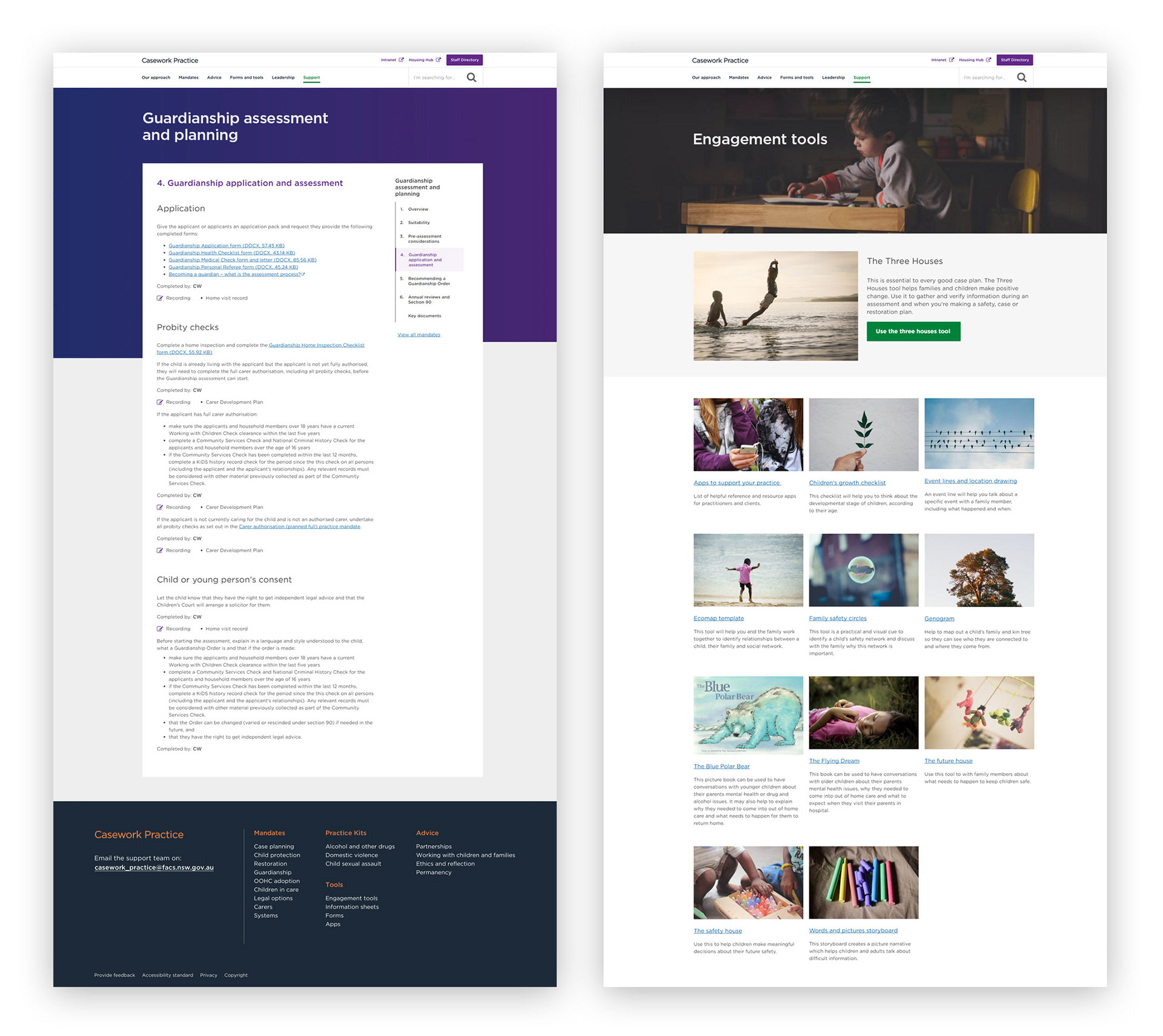
Casework Practice is also a repository for legal forms and trust–building exercises which a caseworker may need when working with a family.
Various seminars and conferences are also stored online to help share ideas.
Our Team
The team consisted of one user-experience lead, one developer, one project manager and up to 5 content producers.
The project client was another department in FACS. We had weekly progress update meetings, and despite on-going change throughout the project, our team focused on answering users needs and forming design patterns on research.
The process
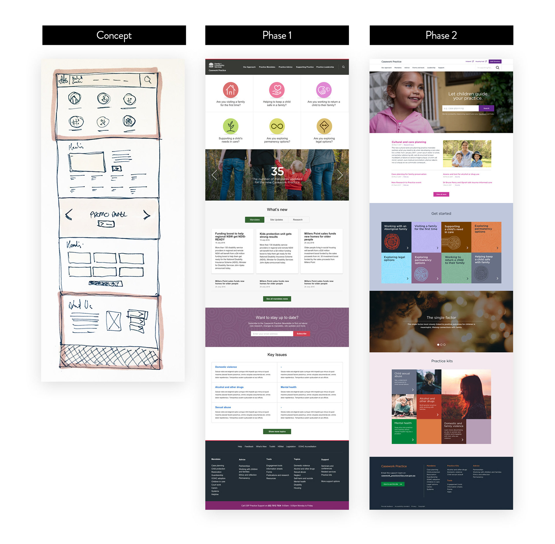
Casework Practice went through two major build phases.
Phase 1 was an unplanned Alpha.
Most of the user research had been done when I joined. I created a visual style which matched the comparative analysis and branding guidelines. The developer rapidly built the site, but the project had underestimated the volume of content that needed to be brought over. User research began to conflict with client requests. When we launched, Casework Practice ticked the boxes on paper, but had room for improvement.
I was then allocated to the Intranet, where I created a design framework that considered Casework Practice, and would ultimately be retrofitted
This down time allowed our magical content producers to work with the clients and prepare the site for a Phase 2 launch.
Phase 2 was a resounding success.
The new pattern library was based around modules, and allowed these building-blocks to be mixed and matched to create effective communication that was structurally versatile.
8 topics were identified in user research which were key needs for many users.
These were existing pain-points; information they wish they had access to, but was often outdated and stored in various formats.
Having this information bundled up in one convenient area was not only useful, but would build trust with users and encourage them to explore the updated site.
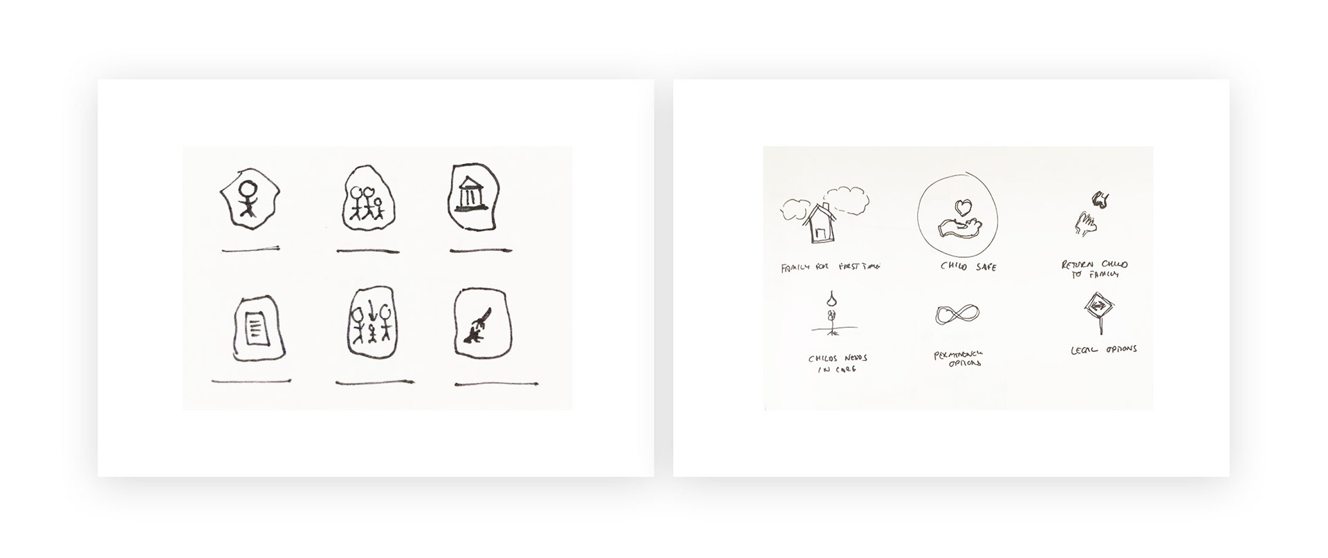
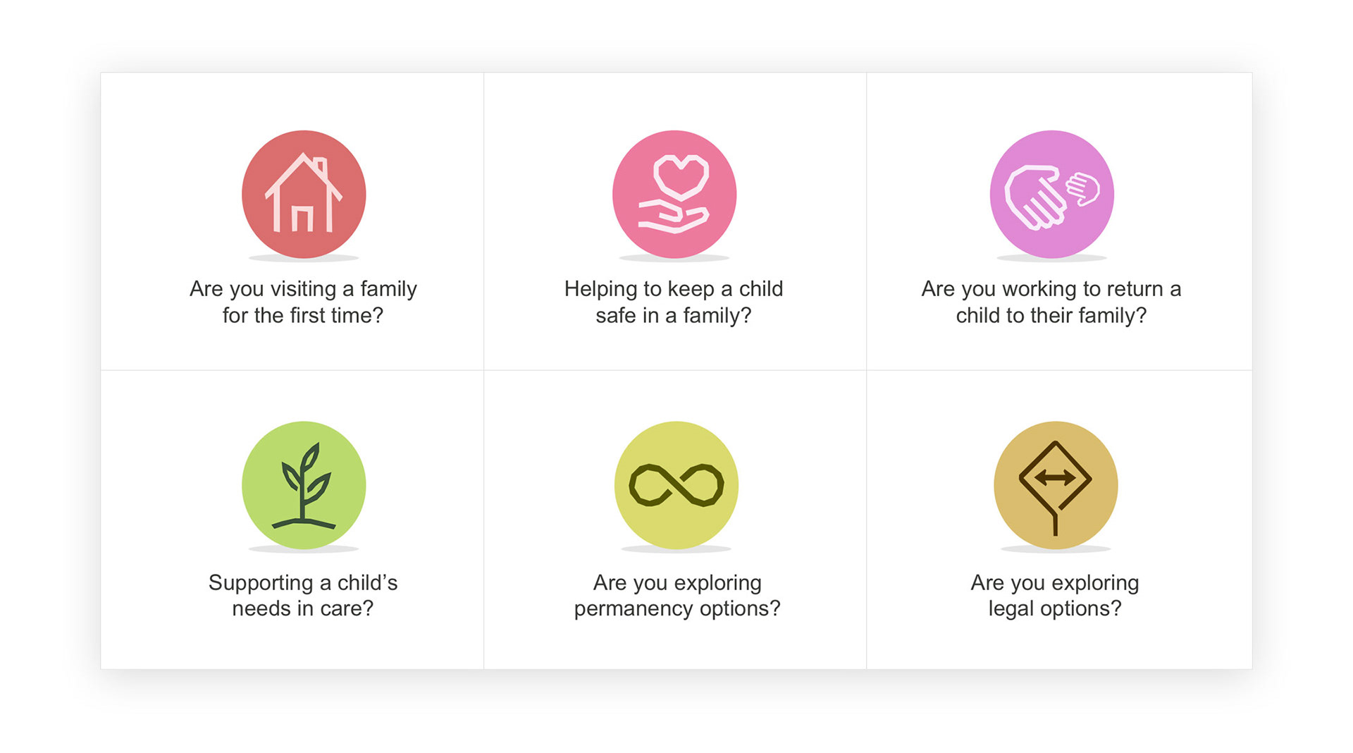
These seemingy innocuous icons would become a key branding element.
They unexpectedly drove a rethink of branding elements such as the colour palette, and the general tone that carried through the design, particularly when communicating culturally and emotionally sensitive subject matter.
A colour palette was sampled from contemporary Aboriginal artwork
This was chosen for a softer, more feminine aesthetic and was less sterotypical of what is considered ‘Aboriginal artwork’.
As was noted on a future project, “we’re sick of seeing dot paintings…”
This colour idea idea came from one of our content producers - someone with extensive experience in the field of child protection and working with indigenous communities.
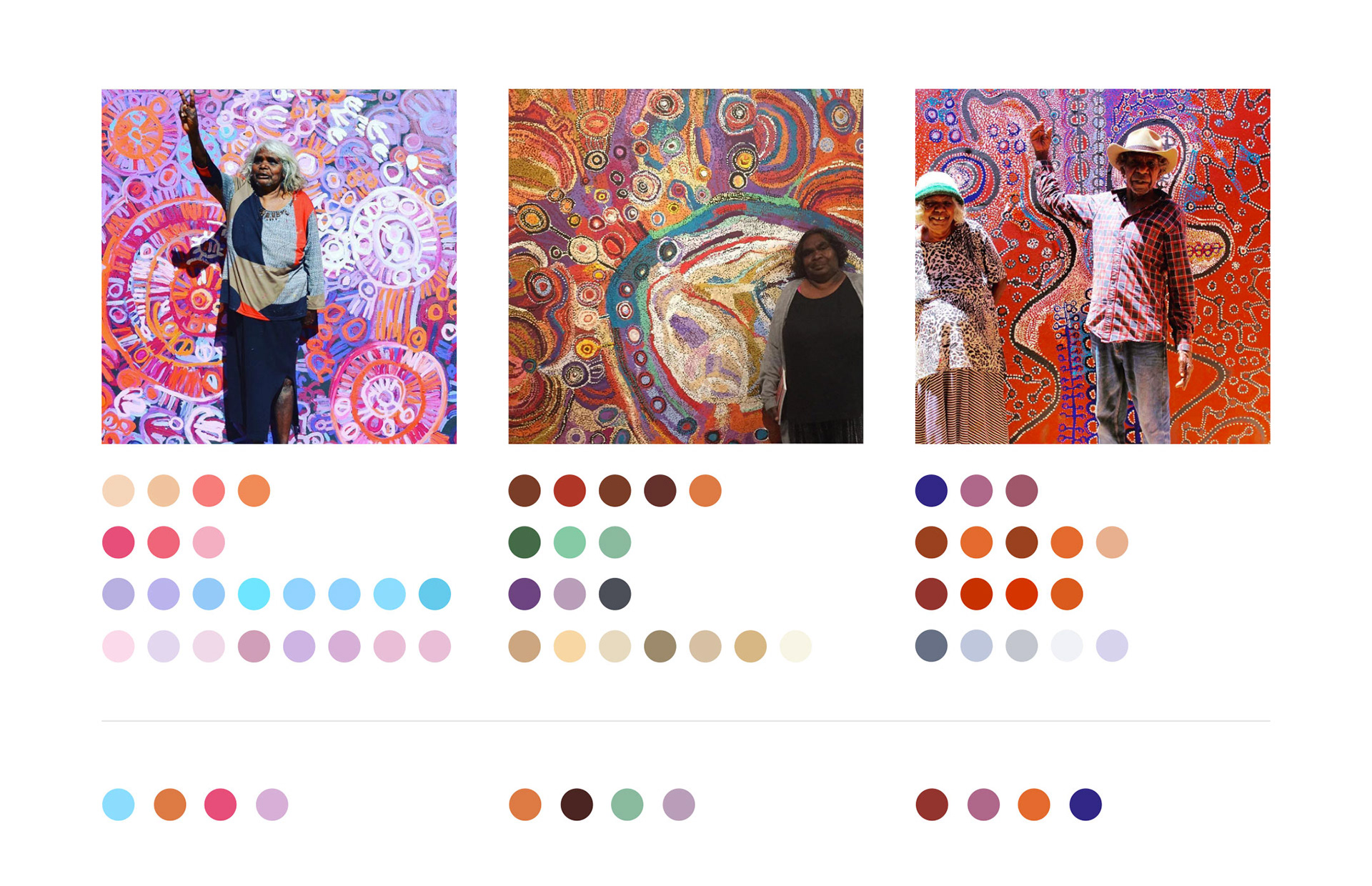
A core colour palette is shared across all four projects - Casework Practice, Intranet, Housing Hub and the Public website.
Each project has a secondary palette which allows the business group a sense of ownership, and a point where future branding work could expand upon.
Final designs
Casework Practice was a change from Matrix, over in the finance industry. This is why I establish a solid rationale. It allows me to work across different industries and get on with design.