Our Team
My role was Senior UI Designer. I worked with the User Experience Lead to evolve the styling from the first project (Casework Practice) and expand the design system for the requirements of an Intranet.
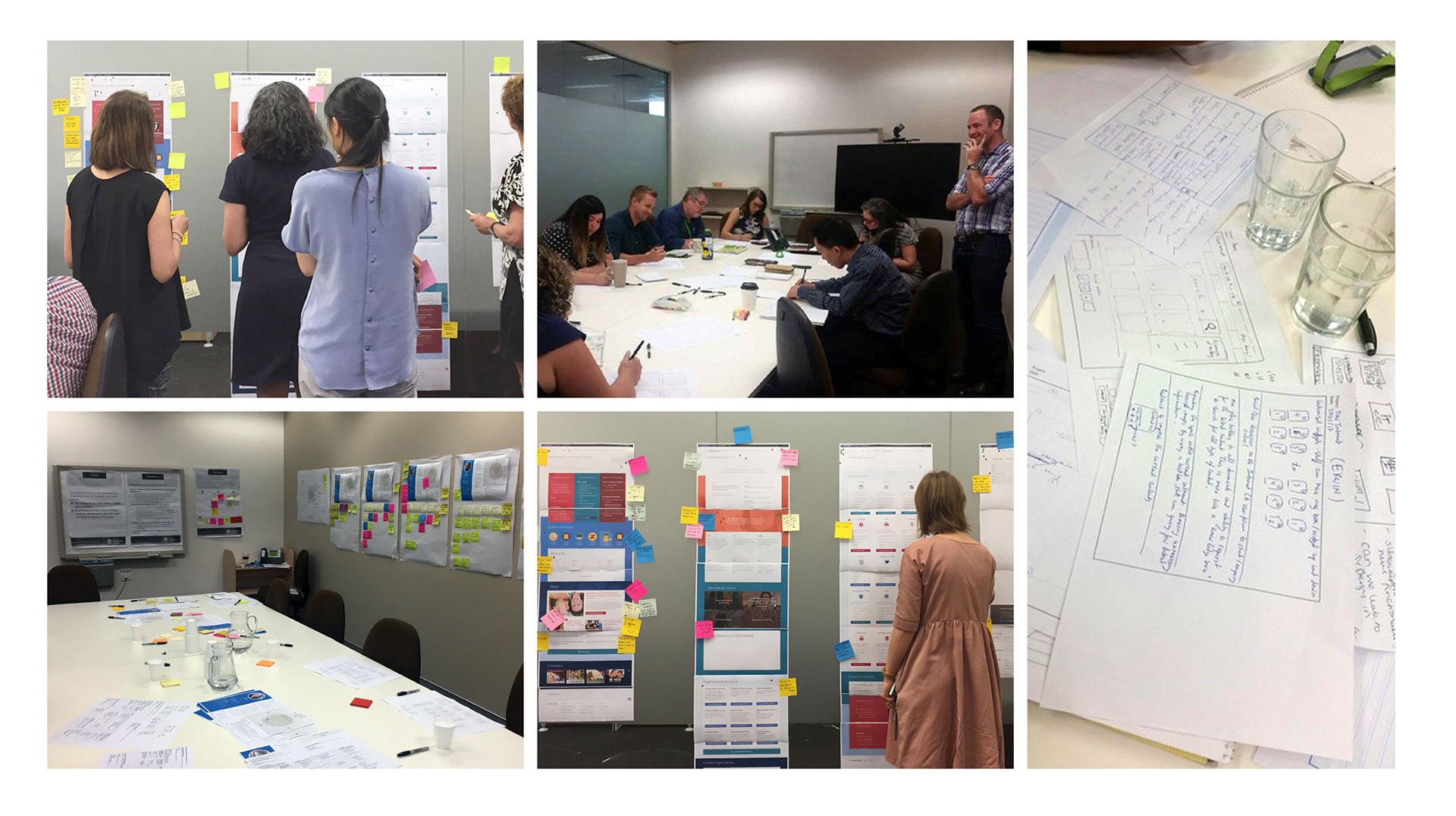
Our project team consisted of 2 User-Experience consultants (lead and senior), 1 Developer, 3 Project Managers and over 12 Content Producers.
The project ran from early to mid 2017.
It’s no wonder Intranet’s are owned by none and feared by all.
Intranet’s are an inherent Frankenstein (the monster, not the doctor). Requirements and success criteria not only vary between everyone involve, but can be moving targets.
Some project highlights:
- Internal restructuring created challenges during the project
- Workshops undertaken to introduce the organisation to design and UX principles
- The bold new direction was a drastic change in how many employees viewed their workplace


The Process
The double-diamond framework was used for the Intranet. This was the first time I used this methodology, and learning when to diverge and converge helped structure the project. We used InVision, Jira and Confluence to prototype, track and store our work.
While the UX guys had their heads down in research and requirements gathering, I used the molecule approach to design as a starting point to create components and pages based on preliminary wireframes. These were broad strokes, however, and it became clear that there was a branding exercise which needed to occur.
I created concepts which gave our team – and users – something more solid to work with. We held Visual Identity workshops (brand onion and scales exercise) and then Visual Design critique sessions which were immensely useful.
Design Principles
Above all: be inclusive, simple and useful. Be frugal, user-centric, purposeful and consistent.
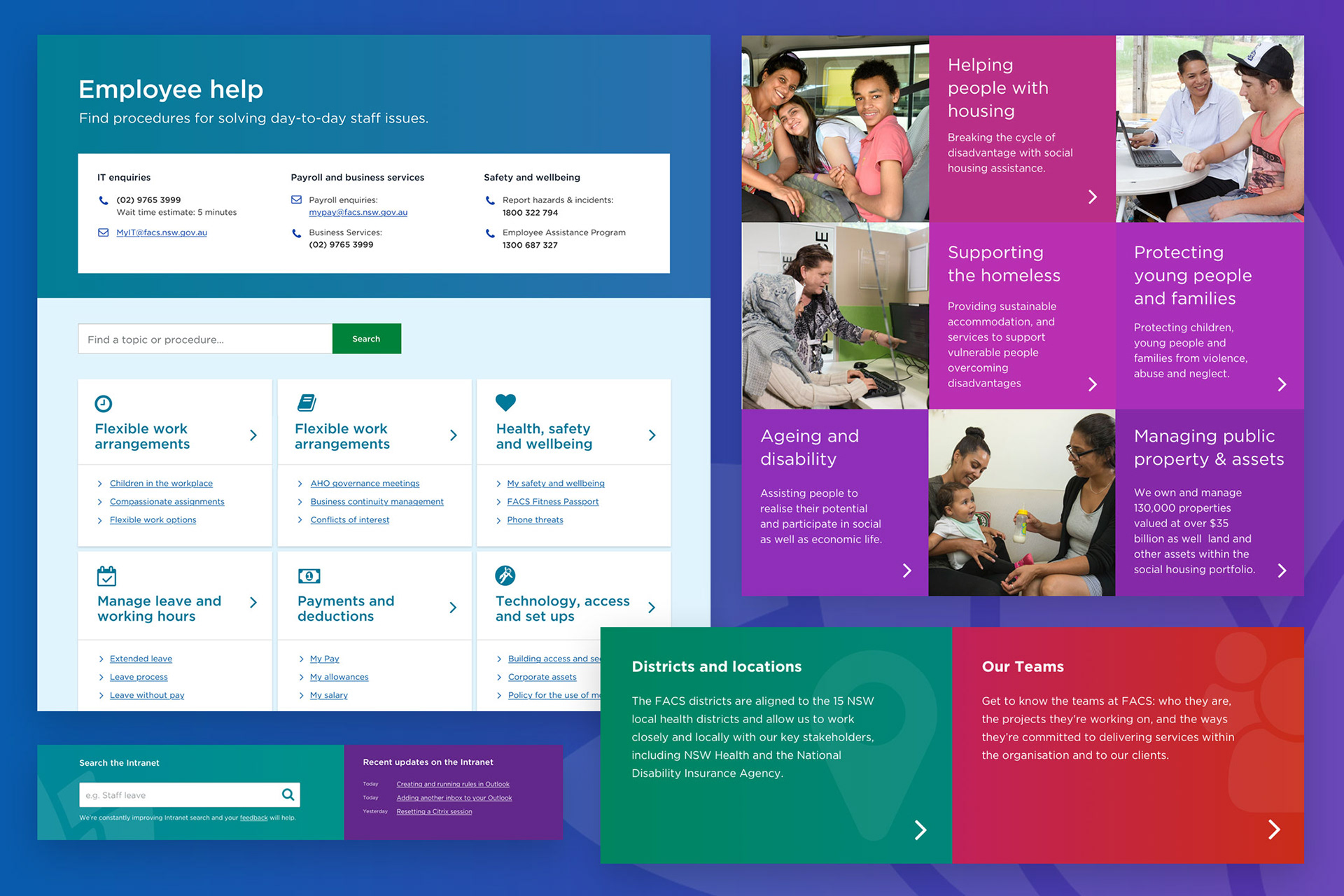
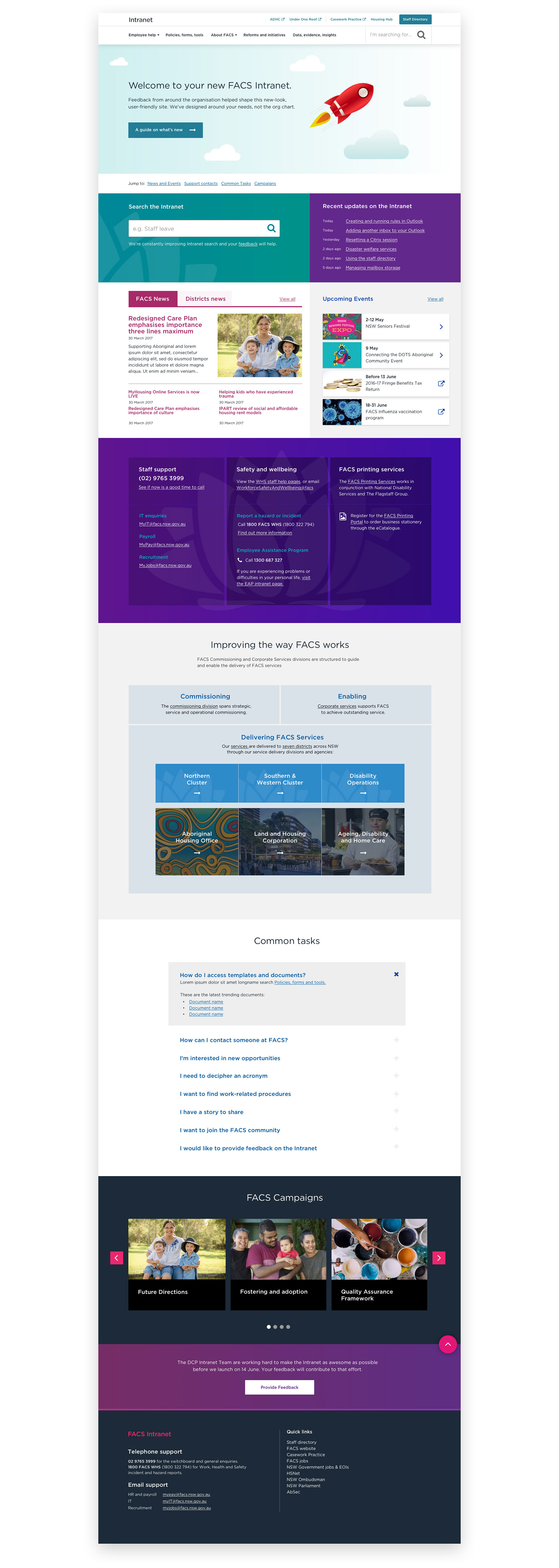
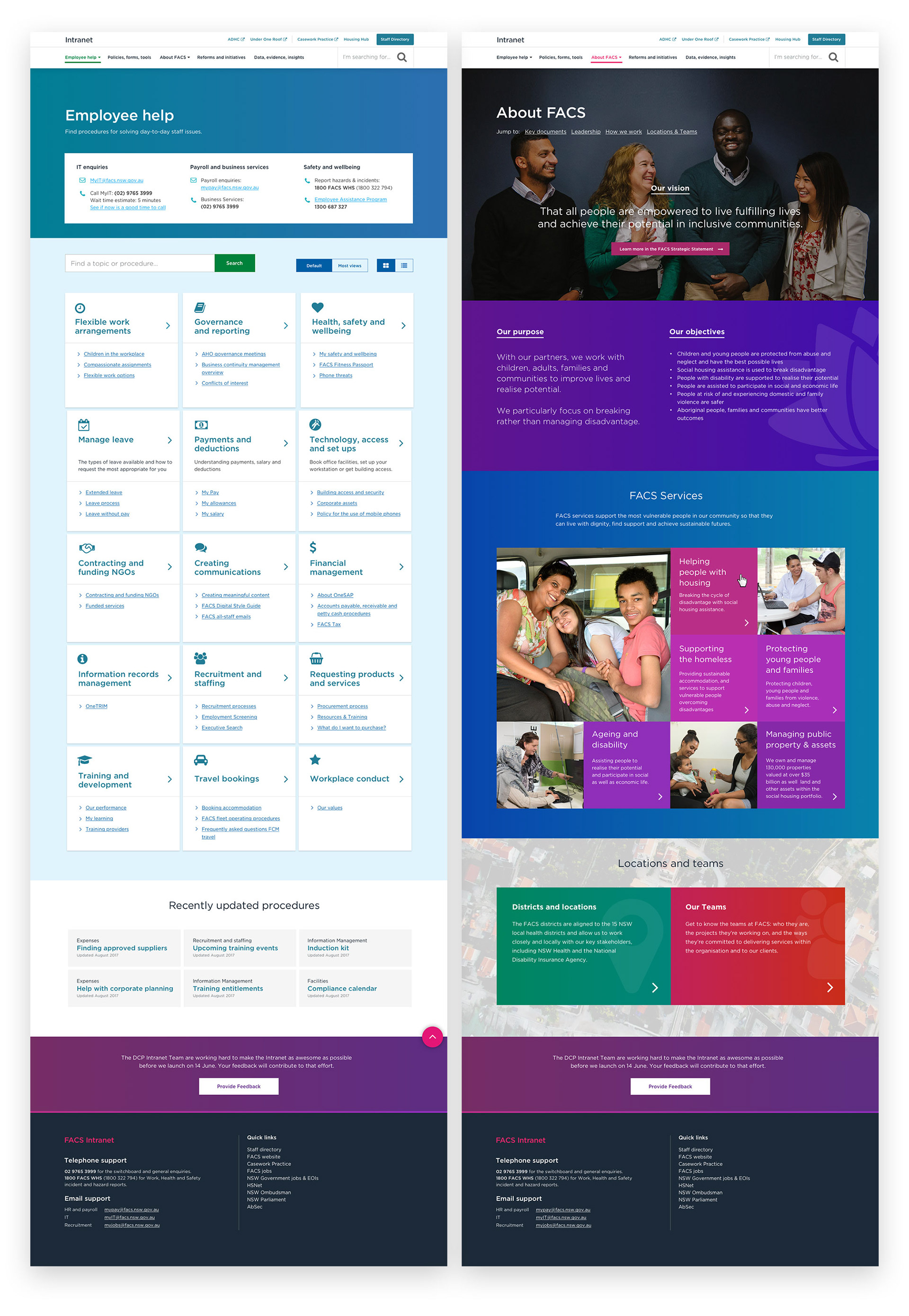
Organise content based on tasks the user is trying to achieve, not the organisational structure.
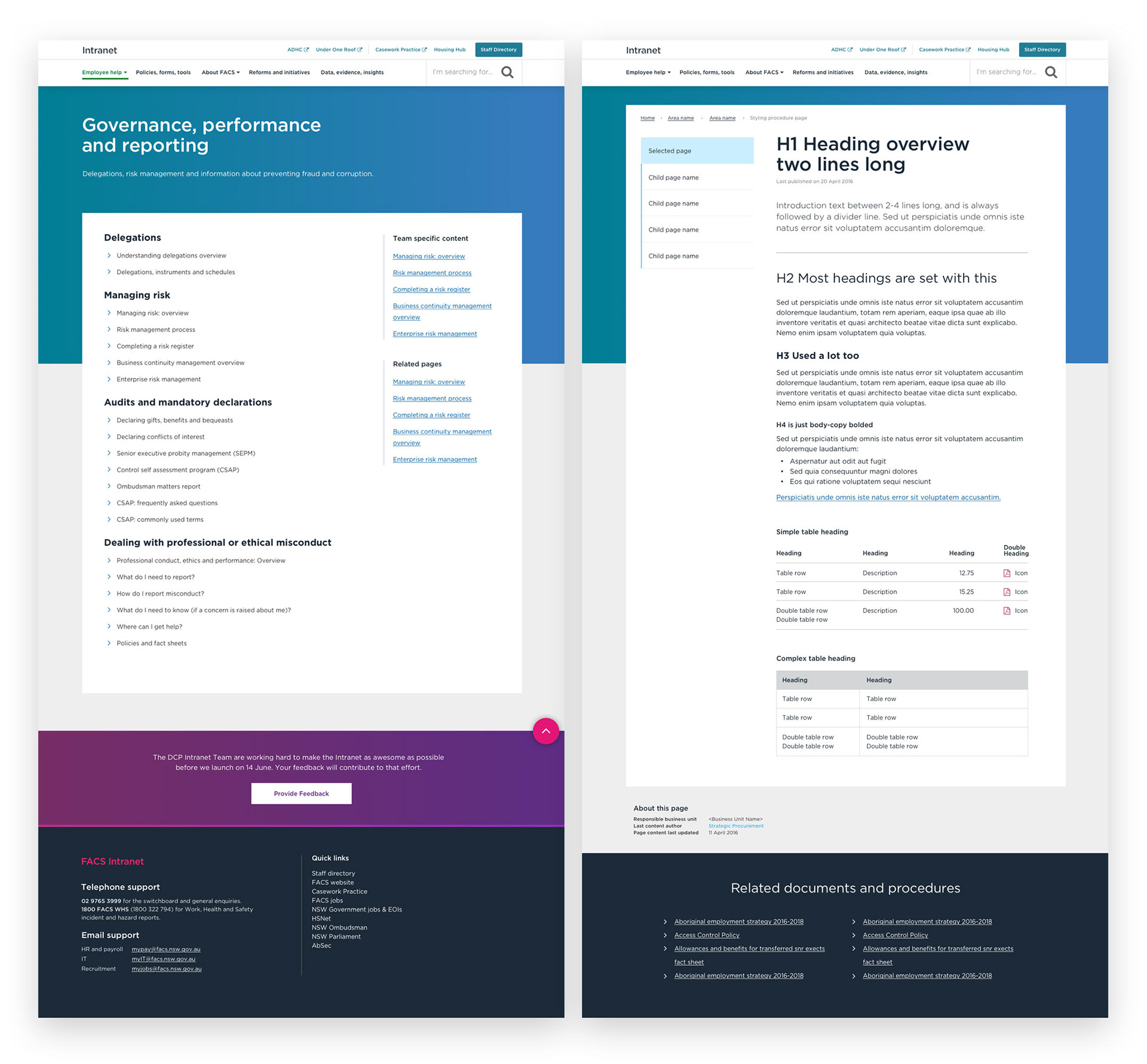
Structure & Layout
- Prioritise design attention on low-level content pages as the vast majority of content is here
- Limit unique templates
- Use coloured panels to visual group related content areas
- Use white space generously
Colour
- Higher-level pages, such as landing pages, are colourful and engaging
- Lower-level pages, such as content pages, are austere; allowing users to focus attention on content
- All colours pass AA guidelines
- Contrasting, saturated colour add excitement
Typography is to be oversized, and uses the NSW Government branding font, Gotham.
Final Designs
The FACS Public site was next (where accessibility is king).
Before Intranet, there was Housing Hub, a simple, clean and functional site.